'%20opacity='0.9'/%3e%3c/svg%3e)
A Material Design Study: Julio
Julio
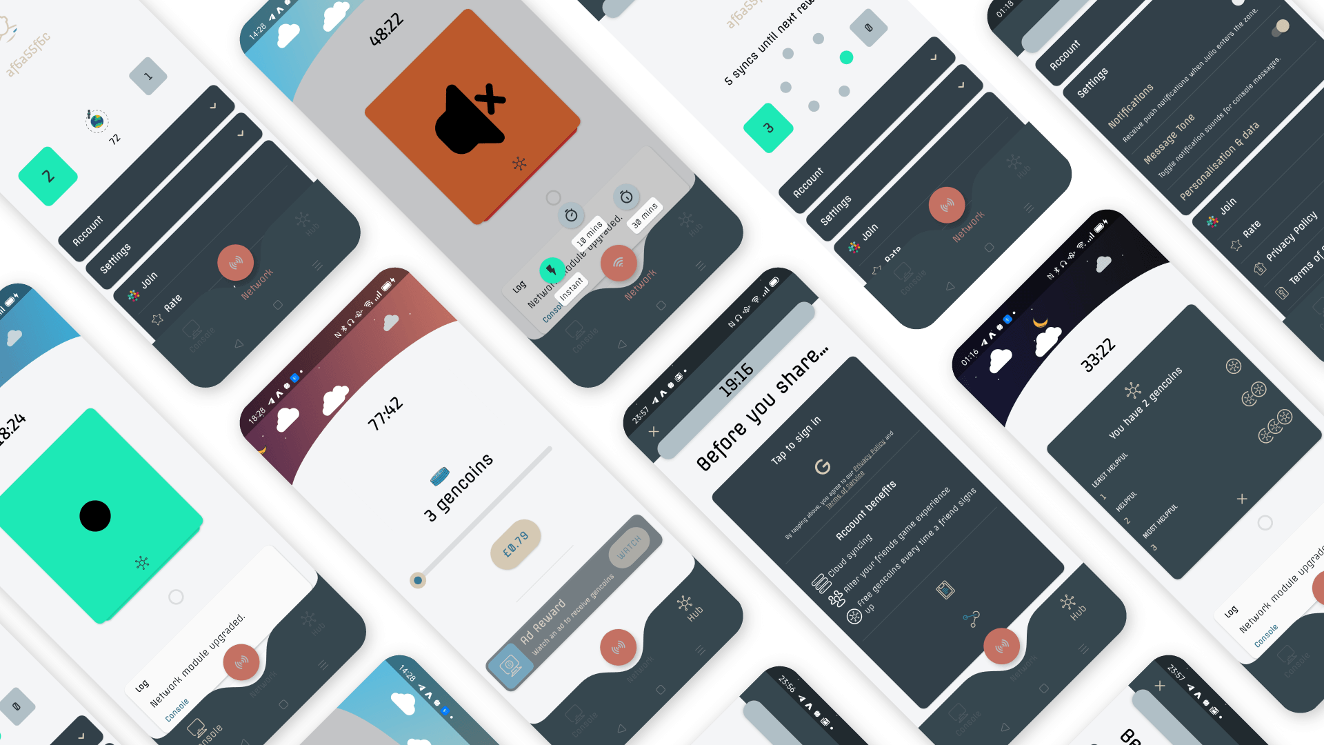
Julio is a puzzle game that makes use of Material Design to create a synergy between its app and game experience. The result is an experience that is playful and exciting yet, reliable and balanced.
About
Julio is a puzzle game, in which the goal of users is to follow cryptic visual instructions from an AI satellite - Julio. Once an instruction is understood, its puzzle can then be completed, and sent to Julio for verification in return for more puzzles.
Functional Design
Julio's design emphasizes clarity and playfulness for a sleek and fluid experience. Attention is placed on functionality and meaningful design to build and maintain user confidence.
To make it easier to understand its layout and capabilities, users are seamlessly onboarded to UI elements incrementally, and only when necessary. For example, on first launch users are initially shown a series of messages in the console inbox - the only element that expresses significant motion without user input. Introducing this component so early on in the user journey significantly reduces cognitive load whilst emphasizing its importance.
Visual Theme
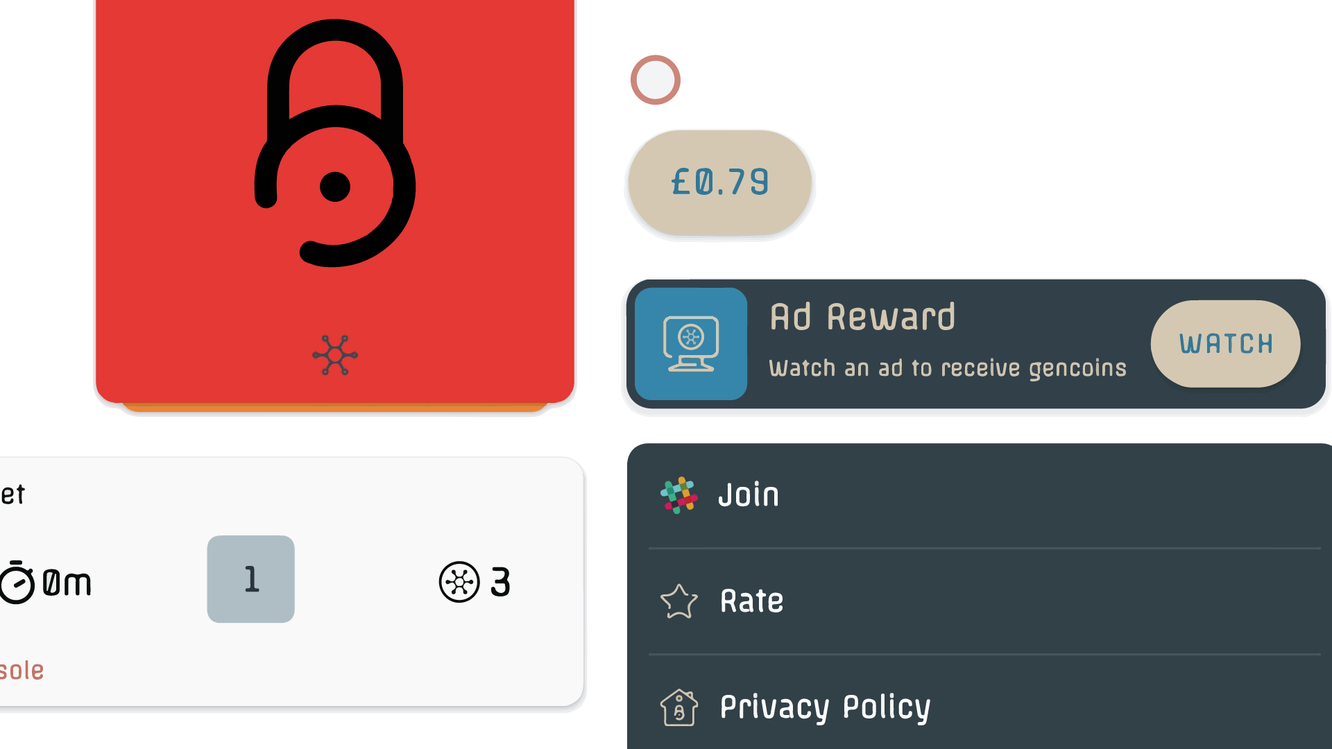
Julio takes an imperative approach to design. Curves are a strong visual theme used on numerous components and elements to further reinforce its quirky and playful nature.
Product Architecture
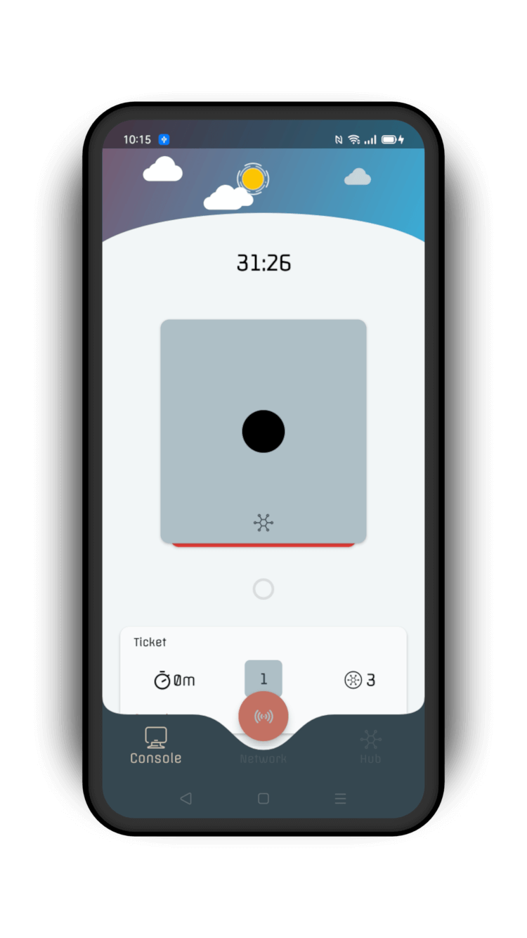
Julio's game experience is embedded into a mobile app interface with two sections; Console and Hub, at the top-level of its navigation hierarchy. It has a spoke-hub navigational structure.
1. Puzzles
2. Inbox tray
The essential game components live in the console which is divided into into two main parts which house a custom viewpager, and a dynamic list with gesture controls. The other screens relate to the Hub, Sharing, and Accounts & Settings.
Navigation
The Bottom Navigation bar is used to access the main game features.
• Console
• Hub
• Network
The Console and Hub serve as "hubs", while a Toolbar is used to access the Account and Share screens which serve as "spokes". This creates a coherent navigational structure in which the application interface does not feel disjointed from the game experience.
Console
Hub
Bottom Navigation bar
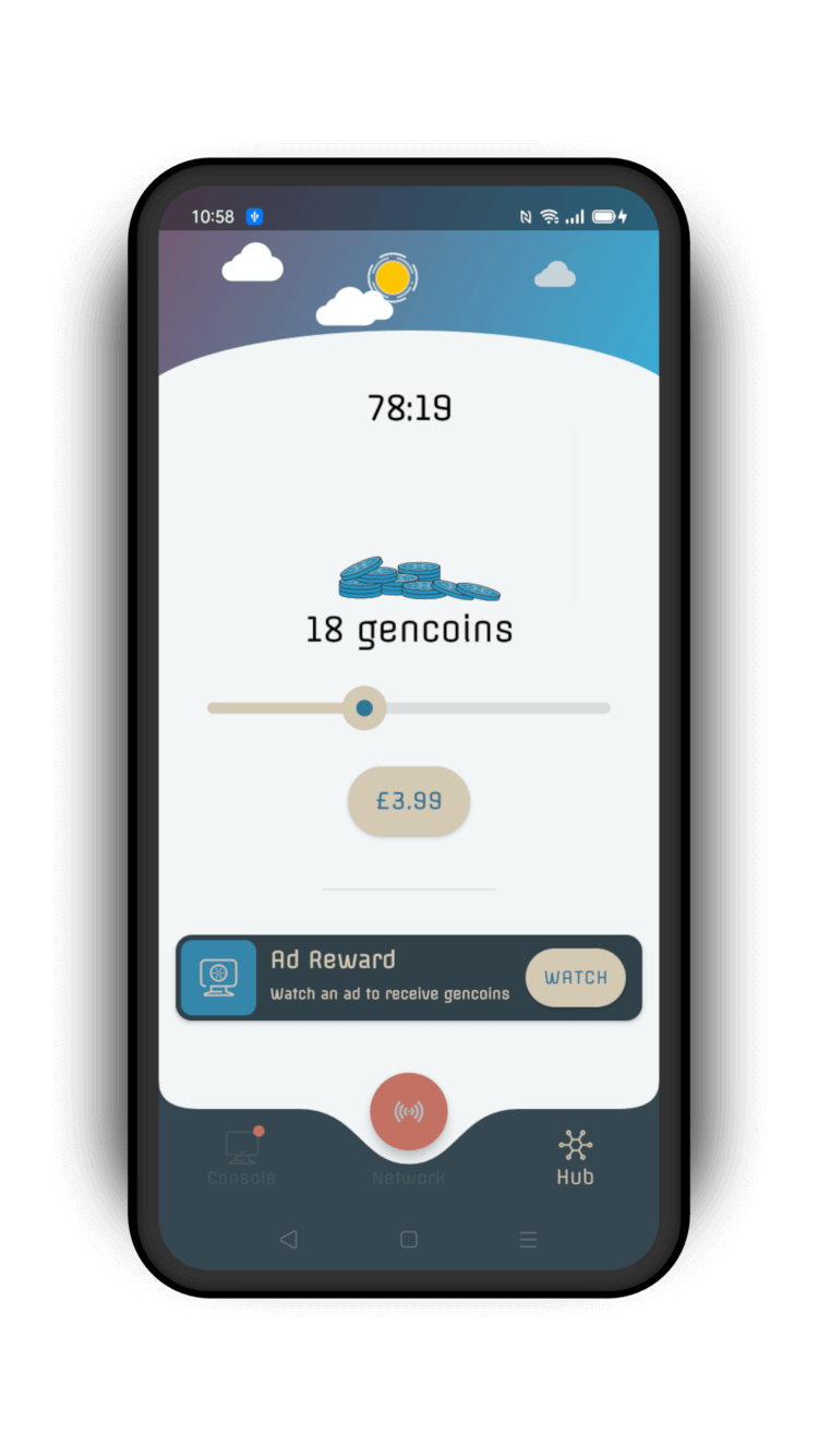
Julio uses a dynamic bottom navigation bar which cradles a custom Floating Action button used to access the Network feature. This feature can only be accessed periodically; when certain game conditions are met. Naturally these conditions also affect the presence of the FAB.
Toolbar
Julio uses a custom dynamic toolbar which houses an array of information.
It allows users to access less frequently used screens such as the Accounts and Share screen. When expanded it also serves as a HUD, displaying dynamic information relating to the connectivity status of the Console, and information relating to Julio's orbit.
Motion
Unique vector animations, spring motion, and custom easing give Julio a playful yet, polished character.
Julio's functional approach to motion design means that animations are strictly used to help users understand and navigate the app. Significant motion is largely reserved for visual feedback and user onboarding.
Onboarding
Julio uses a responsive and playful motion style to guide users by illustrating information at the right time.
For example, shared transformations are used when transitioning from the initial onboarding tutorial to the Console to preserve context and maintain continuity. "Pulse" animations are used on elements to attract the user's attention without overriding their actions.
Onboarding
Shared transformations are used in the transition from the onboarding tutorial to the Console. Once the puzzle card is introduced to users, it is used as a focal point to guide the user journey.
Items are dynamically added to the bottom navigation bar as users unlock more features
Onboarding users to Network transactions
Onboarding users to interactive elements on the Accounts screen
Shared Transformations
Julio uses shared transformations to highlight the relationship between puzzles and their hints. Incorporating motion into a custom viewpager in this way helps simulates a flat hierarchy. Overshoot easing is used to simulate resistance and establish a sense of inertia in the user's choice of action.
Puzzles
Unique vector animations are used to provide feedback to users as they complete a puzzle. These animations largely make use of overshoot easing and dynamic spring motion to provide useful information, as well as keep users engaged.
Send Animations
Julio uses a combination of unique vector animations, ripple effect and dynamic motion in an expressive way to convey whether a completed puzzle was successfully sent, or not.

Typography
Julio uses Offside for its typography. It proves extreme versatility, even with only one available weight variety. Its simple structure and monoline stroke style provides excellent readability on screens even in small sizes. It is slightly condensed with large counters which make it appropriate for writing headlines, or regular bodies of text. Its rounded corners serve the playful theme of Julio very well, helping to reinforce visual harmony across the entire experience.


Iconography
Julio makes use of a carefully curated set of icons with curves and cuts to resemble the style of its typography.
Color
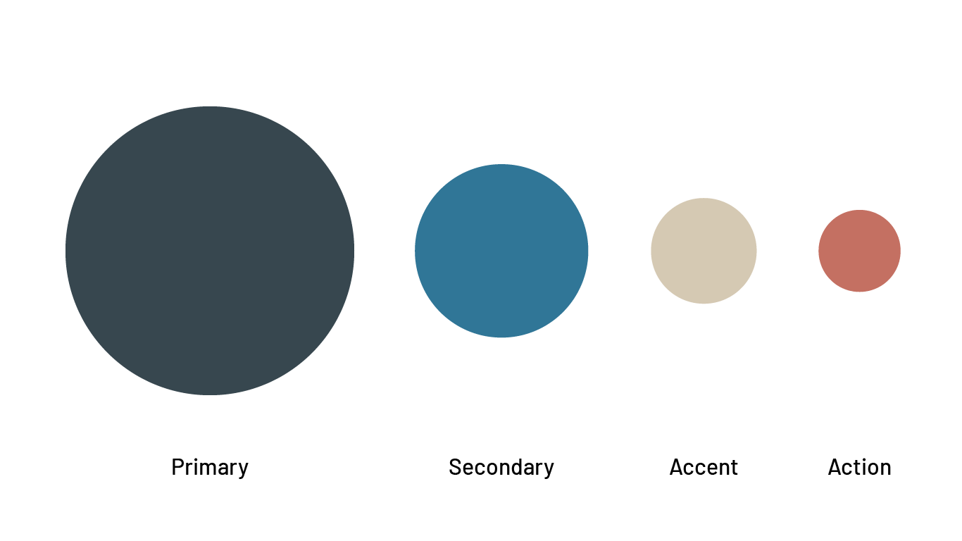
Julio adopts a color theme with primary, secondary, accent colors, and one additional color. A custom semantic color scheme is also adopted which allows Julio to achieve a visual harmony between its game components and app elements.
Elevation
Elevation is used in combination with color to express level of importance, and differences between elements. For example, elements with a higher elevation are lighter in color, and cast a broader shadow. In addition to this, the app background is a shade of gray - further increasing the distinction between elements.
Dark Mode
Julio is able to ensure low visual vibration and readability by choosing different swatches in the colors scheme to serve both light and dark mode.